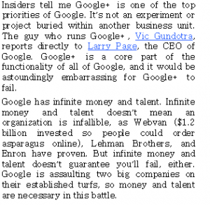
Strange experience reading Guy Kawasaki’s Google Plus book. Thought it would be apropo to buy it on Google Play and see what happened. Well looks good on my smartphone and pretty easy to read. Google Play also loads it up on Chrome on your hard drive. But when I went to read it on Google Chrome, the typeface looked like Ye Old English broken typography that might be suitable for a version of Beowulf.
Here’s a screenshot of how it looks on Google Chrome. You’d think they can make the type more readable. Typeface aside, the content, as you’d imagine, is very good.

